Follow Mike Linkedin Twitter Facebook
Email Mike Email
Marketing & Sales
Sep 14, 2015

5 Signs That It’s Time to Refresh Your Logo

Sponsored Content provided by Mike Duncan - CEO and Creative Director, Sage Island

If you’ve used Google to search for anything lately, you may have noticed it looks a little different. That’s because, for the first time in five years, Google decided to refresh its logo. While the new design isn’t a complete overhaul, it’s different enough to make most users do a double take. See for yourself: 
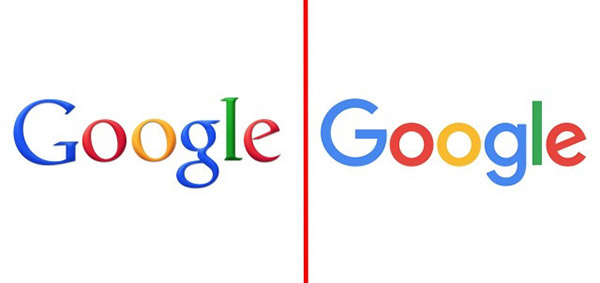


(Old logo on the left; new logo on the right

The Google logo has always been simple, friendly and approachable. The new logo still embodies those ideas, but takes them a few steps further. In the new version, Google ditched the serif (those tiny lines at the end of each letter) for a smoother, more modern shape. The primary color scheme is the same, but the hues have been brightened. And in Google’s other apps, the little g has been replaced with its uppercase counterpart – perhaps as a symbol of Google’s desire to take over the whole Internet. (Just kidding. Kind of.)  
 
While some people have lamented the new logo (it turns out that little g had a large number of loyal fans) most people like the updated look. Even though Google is a massive, powerful and well-known company, it still saw a need to refresh its logo and improve its brand. If there’s a lesson to be learned from this, it’s that all of us, no matter what kind of organizations we run or how great our current logos may be, should take a close look at our own brand identities and see if and how they can be improved.    
 
At Sage Island, we believe that your logo is an integral part of your brand identity, which means you shouldn’t update it too often or without good reason. Doing so will only breed confusion and distrust among your audience. You want an image that connotes trust and confidence, and part of that comes from consistency. That doesn’t mean your logo is a one-and-done situation. It took Google five years to roll out a new design, and it will probably be another five years before we see another change.
 
So how do you know if it’s time to redesign your logo and get yourself a new look? Here are five signs that the time has indeed arrived.

  1. Your business has evolved. The goal of any business or organization is growth, and often that means expanding your services, your reach or your audience. If your logo doesn’t reflect those changes, no one looking at it will realize what you’re capable of. The best logos match promise with perception and let potential customers know who you are and what you do with a single glance. Thus, when your business evolves or changes, your logo should do the same. A change in management, new locations and expanded services are all good, timely reasons to revise and refresh.
     
  2. Your logo is too complicated. Simplicity is the key to elegance. It’s also the key to a great logo. If your current logo is hard to read, crowded with imagery, or contains every color of the rainbow, it will be difficult to recognize and even harder to reproduce, especially on a small scale, such as on stationary and business cards. A clean, clear and simple logo that is immediately recognizable should be your goal.
     
  3. Your logo is outdated. If you’re a cutting-edge technology company, a logo featuring a floppy disk is no longer relevant or even recognizable. The same goes if you’re using an American flag that has 49 stars instead of 50. (Which, by the way, means you haven’t updated your logo in 55 years. What are you waiting for?) An outdated logo says your organization is stuck in the past, and not in a good way. Make sure you’re sending the right message and that your logo is modern without leaning too heavily on fleeting trends.
     
  4. You’ve rebranded everything else. Many people don’t realize that every aspect of a brand identity works as one. If you’ve updated your website, uniforms, tagline and advertising but left your logo as is, it will soon begin to resemble that one weird uncle who shows up uninvited to every family gathering. Every time you make a big change, make sure nothing sticks out like a sore thumb and each piece, from website to logo to swag, looks as if it is part of one big, happy family.  
     
  5. Your logo doesn’t stand out. A logo is often the first piece of your brand’s identity. It sets the tone for your business or organization and informs the rest of your identity package, from the colors in your website to the stamp on your stationary. If your logo uses unoriginal design or stock photography, chances are it will look just like everyone else’s. This makes it difficult for clients to recognize you. You want your business to stand out from the crowd, and the only way to do that is with a custom-designed logo.
If you recognize your logo reflected in any of these five signs, it might be time to consider a new look. If you’re nervous about tweaking your brand’s identity by yourself, have no fear. The team at Sage Island has designed logos for a number of businesses in Wilmington and beyond, and we’ll make sure you look your best, too. 
 
Mike Duncan co-founded Sage Island in 1997, and since then has evolved the agency’s scope to include marketing strategy, creative design, technical development and a wide range of digital marketing services. With an integrated approach that leverages the power and measurability of the internet, the savvy Sage Island team develops strategies, builds brands, writes killer copy and delivers to clients all over the world. And they have an awesome time doing it. Sage’s collaborative working environment keeps creativity and innovation at the heart of the concept. With a 17-year history in Wilmington and beyond, Sage Island shows no signs of slowing down. To learn how Sage Island can grow your business, check us out at www.sageisland.com. To stay updated on the latest in digital marketing, follow Sage Island on Facebook at www.facebook.com/SageIsland, and on Twitter at twitter.com/SageIsland.
 

Other Posts from Mike Duncan

Sage island social ad 5916105915
Ico insights

INSIGHTS

SPONSORS' CONTENT
Gretchen roberts 2021

From Contracts to Offshoring: 7 Powerful Gross Margin Growth Levers

Gretchen Roberts - Red Bike Advisors
Chris 16239425

E28: Chakema Clinton-Quintana – The Universe is Listening…

Chris Capone - Capone & Associates
Bovio ernie ceo 240207 head 712412398

Everything We Do, We Do It For You. National Recognition Is Deserved, But Community Motivates Us To Do Our Best.

Ernie Bovio - New Hanover Regional Medical Center Novant Health

Trending News

North Front Street Property Sells For More Than $2.8M

Staff Reports - Dec 6, 2024

Biggers Market Plan For CB Road Store Heads To Commissioners

Emma Dill - Dec 6, 2024

In The Current Issue

Rebranded MLS Follows Tech Buzz

When officials rolled out Hive MLS, a rebranded version of the former N.C. Regional Multiple Listing Service, they said Hive comes with new...


Info Junkie: Lannin Braddock

Lannin Braddock, owner and founder of The Braddock Group, shares her picks for podcasts, book recommendations and favorite apps....


Raising A Different Kind Of Glass

While at events, Carter Jewell realized something was missing: an alcohol-free option that wasn’t just water or soft drinks. Something that...

Book On Business

The 2024 WilmingtonBiz: Book on Business is an annual publication showcasing the Wilmington region as a center of business.

Order Your Copy Today!


Galleries

Videos

2024 Power Breakfast: The Next Season