Stop. Yield. Do Not Enter. One Way.
Road signs are the ultimate example of simplicity in communication. They express their respective messages in the absolute quickest way possible, and their shapes and colors often impart meaning without any text at all.
A stop sign, for example, is incredibly simple. The red octagon is synonymous with “STOP” across the country and the world. The color is bold, the type is simple and contrasting, and the sign (hopefully) causes an immediate action.
Road Signs and Marketing
Marketers and brands would be wise to mirror the messaging of road signs. Just like the blunt simplicity of a stop sign, marketing efforts should be direct and straightforward. Brand imagery, logos, taglines and overall marketing should tell target customers exactly what they need to know in the most succinct way possible. Above all else, your target customer should be able to easily comprehend what your brand is trying to communicate.
Taglines, for example, should be bold and easy to understand, like a bright stop sign along the side of the road. In the same way that road signs are scattered across the country on every kind of street imaginable, your brand needs to work on multiple platforms, including social media, print and even on a delivery truck.
The Importance of Being Consistent and Direct
The best way to ensure consistency across mediums is to maintain simple and direct brand that will communicate the same message no matter the platform. In today’s world, the consumer is being bombarded with over 5,000 brand advertisements a day, according to
a study quoted in the New York Times.
Last year, the number of small businesses in the U.S. grew to almost
29 million. The small business landscape is more competitive than ever, with similar companies vying for the same limited time and attention of customers who are overexposed to marketing from the second they wake up in the morning.
Not only will being consistent build trust with your target consumers, it will also make you more recognizable and make your brand stand out from the rest.
Today’s sensory overload means that overly complex brand messages can easily be lost and overlooked in the chaos. Your brand’s message needs to be communicated in the blink of an eye.
The Simplicity Trend
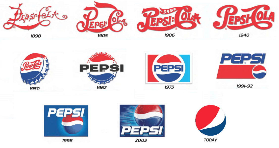
Time is a commodity, and major billion-dollar brands like Starbucks and Pepsi understand the need to be direct in their branding.
For example, take a look at the Pepsi logo over time. The brand started with ornate, detailed text in the 1800s and has evolved to the iconic, tri-color circle that is widely known today.

Image c/o Logoaster.com
The same can be said for Starbucks. The company’s logo simplification has been the debated heavily in the media, but the company has maintained the same core imagery and meanings while cutting down on extraneous messaging.

Image c/o DesignHill.com
Take a moment to reevaluate your brand’s messaging:
- Could your brand be simplified?
- Is it consistent?
- Is it cutting through the white noise of the marketplace?
If you aren’t sure how to get started with your answers,
get in contact with us. We’d love to get you started on the right path and help you achieve your long-term goals.
Bill Hunter and the WDC team believe that honest business and innovative design go hand-in-hand. Their talented team of designers, marketers and developers are as diverse as our work. They offer a range of services, including marketing strategy, branding and creative web and application development, as well as digital marketing solutions specific to your business. Contact Bill at [email protected] or visit www.wilmingtondesignco.com.


